

Designing for AI adoption: Cleartrip's first AI feature, Smart filters
Designing for AI adoption: Cleartrip's first AI feature, Smart filters

Smart filters at a glance
Smart Filters are Cleartrip's first AI feature, they enable users to filter flight results by typing what they want in plain language, instead of the regular back and forth with the filter section. Users describe the flight they're after in one sentence -> AI reads the intent -> Surfaces the filters it understood -> Then applies them once the user confirms.
Impact
Users decided faster, multi-day users closed bookings in four days against a seven-day norm, and 14% come back to the feature organically
Device
Mobile app (iOS + Android)
Duration
4.5 weeks
My role
Product Designer
Team
Mayank Gaur (PM), Vaibhav Gupta (UI Eng), Sujit Jare (My manager)
Problem
Filtering down THE ONE flight takes effort. Its a back and forth between applying and reapplying filters.
Solution
A prompt based experience which allows users to describe their desired filters in natural language.
Scope of work
Designed the entire flow and visuals myself.
Wrote and documented AI design principles
Conducted secondary research to map
Smart filters at a glance
Building Cleartrip's first AI feature. Smart Filters lets users filter flight results by typing what they want in plain language, instead of the regular back and forth. Users describe the flight they're after in one sentence. AI reads the intent, surfaces the filters it understood, and applies them once the user confirms.
Problem
Filtering down THE ONE flight takes effort. Its a back and forth between applying and reapplying filters.
Solution
Filter using natural language prompts. I led design on Cleartrip's first AI feature. That covered the AI rules the team worked to, the UI/UX, and maintaining an AI component library.
Impact
Users decided faster. Multi-day users close a booking in four days against a seven-day norm, and 14% come back to the feature on their own.
Device
Mobile app
My role
Product designer
Duration
4.5 weeks
Team
Me, Mayank Gaur (PM), Vaibhav Gupta (UI Eng)
Scope
AI Design Principles · Desk research · UX/UI
Context
Traditional filtering felt like work, so we made it easy
When looking for flights “Cheapest nonstop that lands before noon” becomes four choices across four categories. Users usually apply then reapply until the results look right for them. So we let users describe it just like they think it.
Smart filters read the prompts and surface the relevant filters. Users can then manipulate the presented filters or apply directly for desired results.
Before smart filters
But why start with “filters”?
Where we put our first AI feature mattered a lot more than what it did. This feature was doing an additional job; it was also carrying a read on how our users use AI. Filters won because:

Filters are finite, so we could check AI had mapped a request onto something real.
Its safe because manual filters stay on the page, so a bad answer leaves nobody stranded.
Applying filters is a important part of almost every search, so bigger learning opportunity
Pre design basics
Task 1: Setting concrete AI rules before touching Figma
Nobody on the team had a shared basis for making AI decisions. I pulled together existing AI design guidance, adapted it for travel, and took it to the team.
Human agency over automation. AI assists. Anything it applies, users can override instantly.
Transparency. "Magic" breeds distrust, if AI changes the results, show why.
Handling failure gracefully. AI will sometimes misunderstand, and how it handles being wrong defines the design.
Setting these was important principles as they capture my belief that AI in design, should be human led, and exhibit human traits like clear communication, support through failures and nudge towards sucess.
Strcutural decisions
Introduce + Educate: my mantra for first time discovery
This was the first AI feature on our platform, so nobody arrived knowing what to expect. That made the entry point the riskiest screen in the project. A first attempt that misfires does not get a second one, and what we lose is not a filter tool, it is the argument for AI on the platform.

Initial win: bottom sheet vs immersive
I said NAY! The team's early direction was a standard bottom sheet. I pushed back, and this became the first real disagreement on the project. And there are two reasons for it,
An Indian user’s intuition the moment they see a bottom sheet, is to close it. Bottom sheets are abused for ad placements, friction (some good, some bad) and I did not want the feature to be ignored because of it.

Design implementation
Designing the UX architecture for AI experience
A filter list has a fixed number of states and I could design every one. A text box has no such limit. So we had to design a system which allows for current capabilities and goes beyond to support as many user queries as possible.

Happy flow 🌸
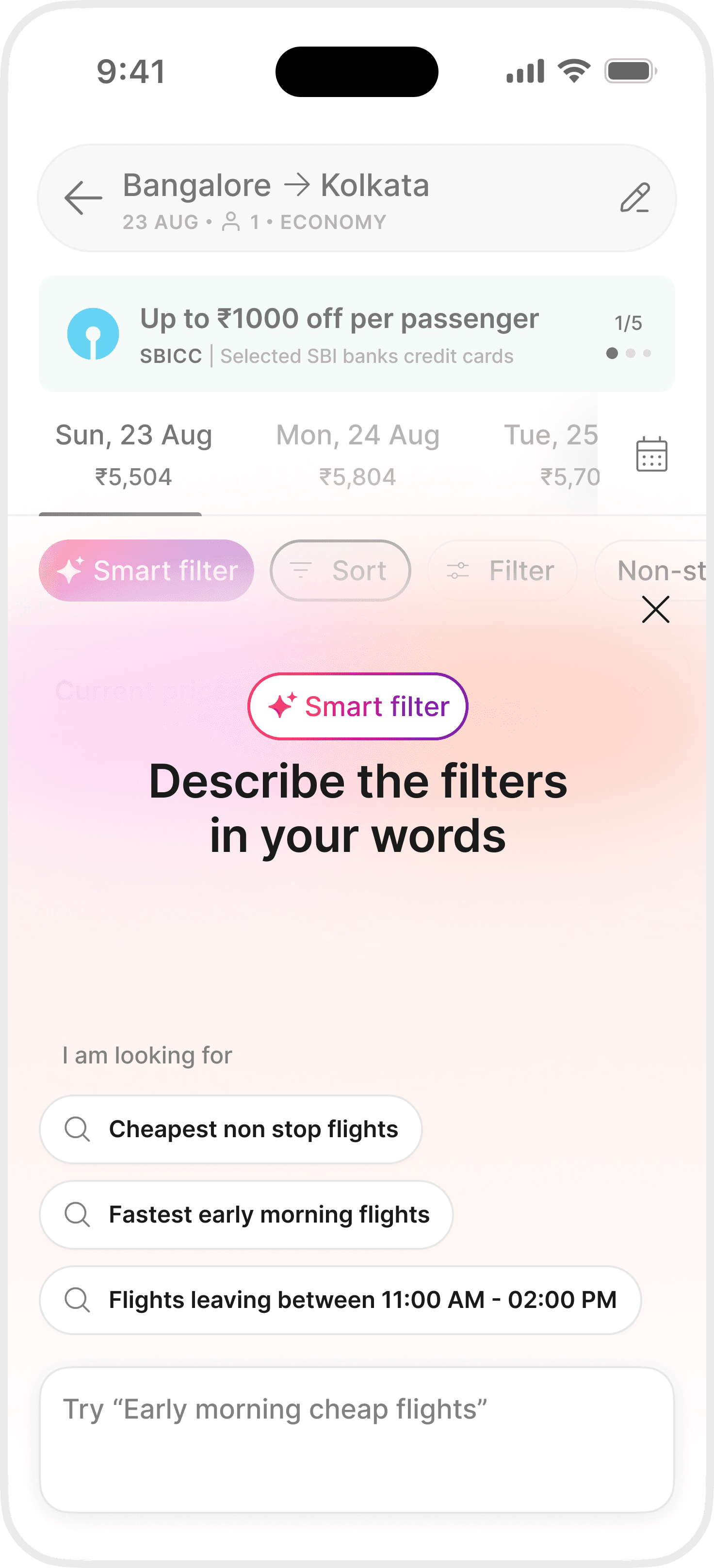
Introduction has to be impactful
The first experience of a user with Smart filters would be how they invoke it, I wanted to make sure it did not run stale.
The overlay should feel like it can read the screen in the background
It should not feel like a mechanical dialog box
It should create a moment of delight for our users
Tap over typing for AI
Smart filters was not just our pilot with AI, a lot of our users would be using AI for the first time in general, and our data science team backed the idea too.
Tapping reduces decision paralysis of what to type
Quick chips enable users to move forward in the journey
I wanted to make users feel confident with the feature, not anxious for about doing it wrong
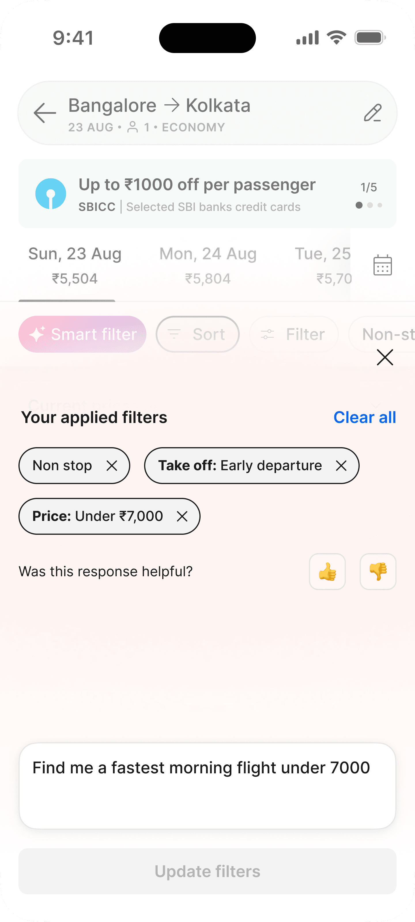
A glimpse of future capabilities
While we couldn't fulfill every open query we might get, some queries like changing the date or destination, were achievable. So the system reads the intent and redirects the user to the right path.
Aligned the stakeholders to allow for more than just filtering, change of date/destination
Hand off the task to users, let them decide what they modify
These queries will help us understand how interested users are to use AI for exploration
Designing for failure scenarios
This was one of the most important use cases we had to fulfill. Not understands the scope or limitation of the system, sometimes users want more and since we cant provide, how should we handle?
User should never feel stranded, they should know next steps
Always give alternates for quick journey progression
User should not be discouraged to try again!
Design x Engineering
I couldn't imagine every bad query, so I broke it down with engineering
Rules and screens only cover the cases you can think of. I sat with the front-end and LLM engineers and we spent sessions deliberately trying to break the working build. Nonsense queries, contradictions, requests for things we don't sell. Every failure surfaced a case nobody had designed for, and I was drawing new components in the middle of those sessions.
Watching your own design break in code is a strange kind of fun. Everyone was building an AI feature for the first time, and the team was up for reworking things on the spot.
Impact
Users decided faster, and came back organically
Flight bookings rarely happen in one sitting. Users search, leave, compare and come back. Most Cleartrip bookings close within seven days of the first search.
14% users returned to use Smart filters, and booked 3 days faster after
More than the UI, educating users on how to use Smart filters was the bigger concern for me as well as the whole team. We had no idea whether users would take to a text box on a page they had used for years. They did, and they brought themselves back. Intent classification still needs work, since AI reads some users wrong, and that's the next thing worth getting right.
Future scope
Users have learned to filter, so search is next
Smart Filters had an additional job underneath the first one. It teaches users that they can describe what they want here, and that the page will do exactly what they asked.
They learn a new way of asking. We get the time and the data to build for what they ask for next. So Smart Filters merges into the AI work coming after it. Eventually, describing what you want becomes how searching happens on Cleartrip.
My learnings
What Did I Learn?
This project was more about system design. The delight was in query handling, education and graceful error handling. I truly enjoyed spending time off canvas to enhance these intuitions and make these concepts stronger,
Trust is a design material. Every decision either spends it or builds it.
Designing the failure matters more than designing the success. What the product does when it misreads someone decides whether they return.
Borrowed frameworks have to be translated. Guidance written for shopping doesn't survive a category where a wrong answer costs someone a flight.
I'm available
Let's Connect
and create something amazing together
Contact me @masih.raj9@gmail.com | +91 9557894232
Let's Connect
and create something amazing together
Contact me@
masih.raj9@gmail.com
+91 9557894232
I'm available
Enjoy the bigger picture on a bigger screen :)